Terminator: Genisys Bargain Basement Promotion Continues
I’m not sure I can remember a movie that has been so badly promoted. Not necessarily lazily, because they’re putting stuff out there. But badly, the posters being particularly ghastly. I thought it couldn’t get worse than the last one, but check out the international poster below, to see that it has.
I mean, some of the CGI, even in the posters themselves, is unspeakably awful. You’d think that being a still image and all that they could touch things up. I almost can’t get my head around how they continue with this line of promotion. Say nothing of the huge spoilers that litter the trailers – if you could call them spoilers.
I mean, look at the gaping wound in the new T-1000. What the fuck? What am I looking at here? Ghastly! How can this Microsoft Paint hackjob look inferior to the original artistry from a movie 25 years ago?
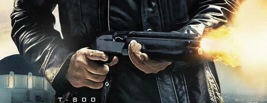
Or, as someone pointed out in the comments section for the previous posters article, look at this gem. Schwarzenegger’s shotgun is firing yet his finger isn’t even on the trigger. And look at the bottom of that right hand, what the hell is going on with his little finger/knuckle? His hand looks mutated. That couldn’t possibly be some lazy as hell Photoshop warping, could it?
Anyway, here is the new international poster. And again, it sucks. See for yourself why. Why is promotion so bad? Again, I’m just going to have to speculate that Paramount, not having 100% investment in this (others have pitched in), couldn’t give a fuck, now that Mission Impossible: Rogue Nation is their big summer hitter.


12 Comments